
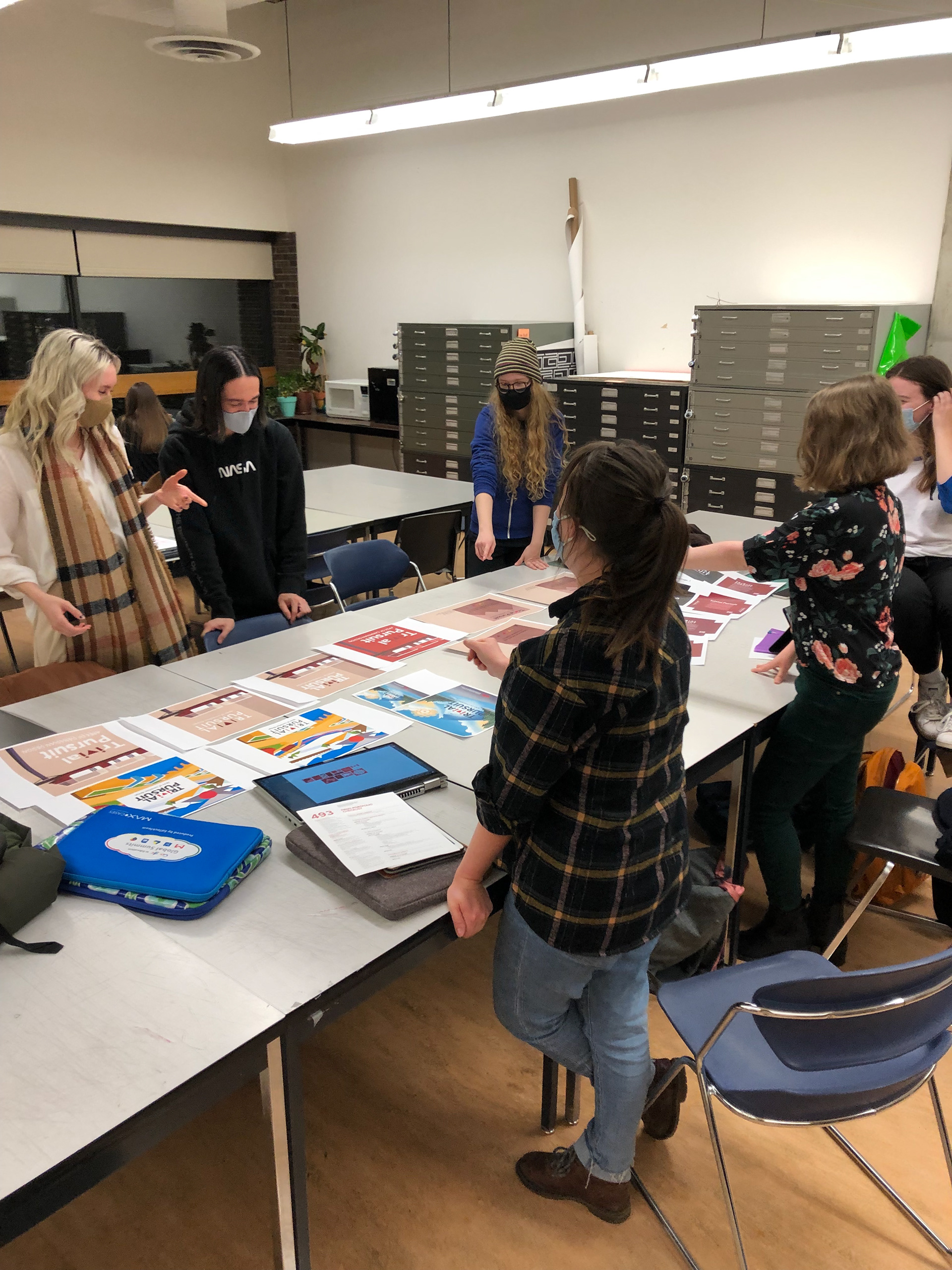
The goal of this project was to recreate the board game: Trivial Pursuit to be all about Canadian Design and Canadian designers. In this project, we worked in a group assigned by the instructor and collectively worked towards creating components of the board game. We all brainstormed together and then came back with individual ideation work, then we voted on a direction to follow and everyone created assets that would work with our chosen direction. Then, the group voted on which assets they believed worked the best based on the direction, and this process was repeated, until each component was decided. The final product, therefore, is a culmination of bits of everyone’s ideas.
To start off, we brainstormed taglines that would pair with the logotype (which will stay as Trivial Pursuit) and the group came up with "The Apex of Canadian Design" referencing both the type anatomy of an apex, and the peak.
INDIVIDUAL WORK
These are the pieces I worked on based on the direction voted on by the team.

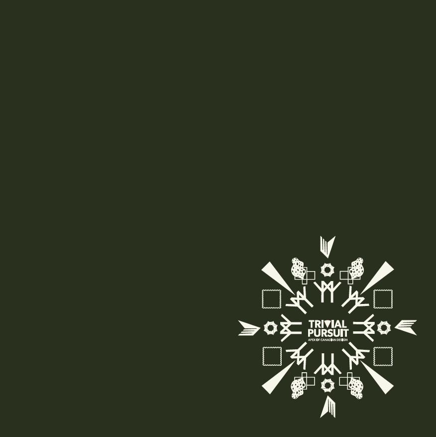
Logotype - Inspired by Louis Fishauf's visionary eye motif, seen in his digital collages done for apple, adobe and et. cetera. The logotype also uses a Canadian typeface: Roma Inline, with the V being exaggerated and the point emphasized by an eye motif. This is to reference the tagline the group decided on: "The Apex of Canadian Design"
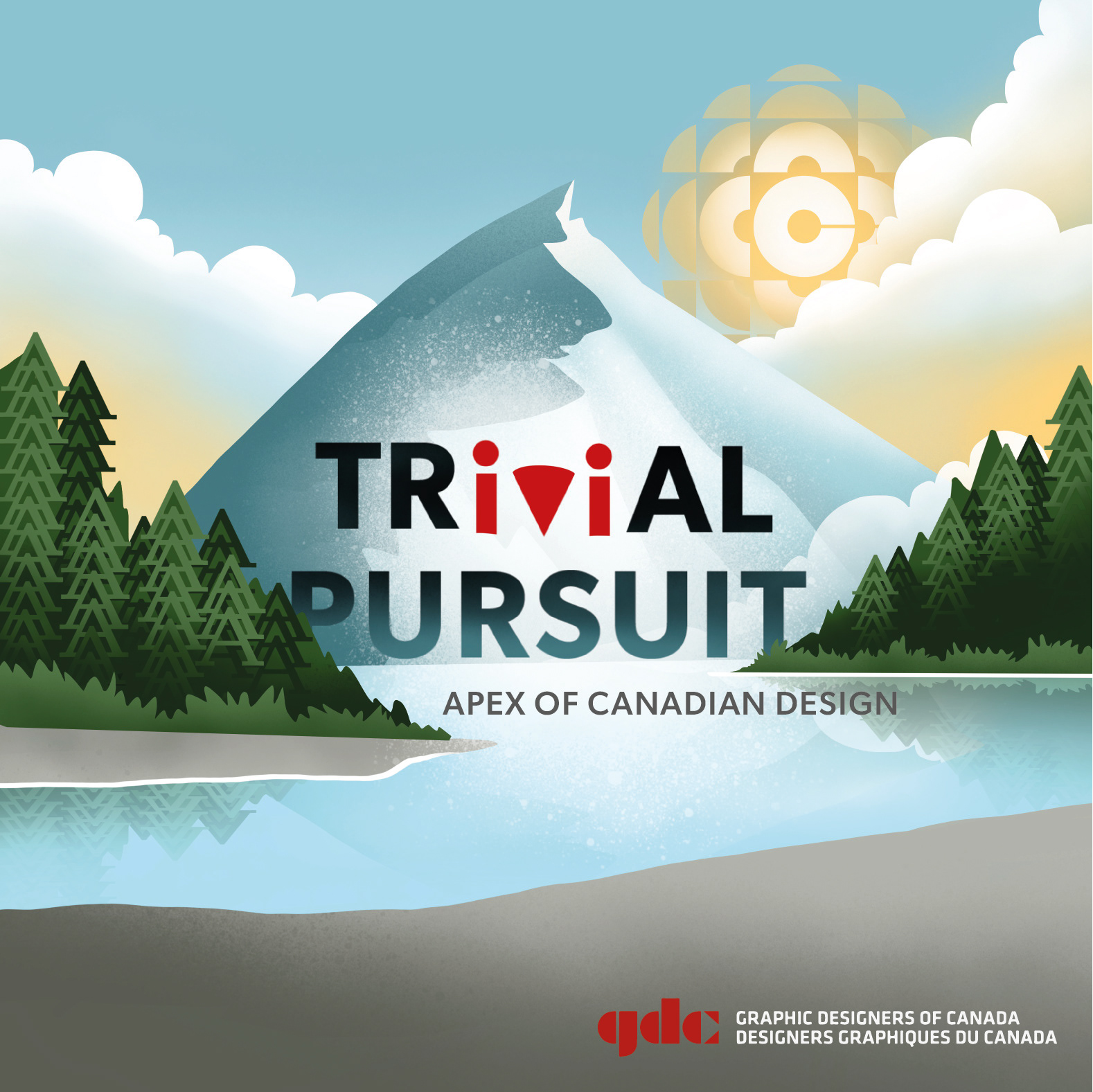

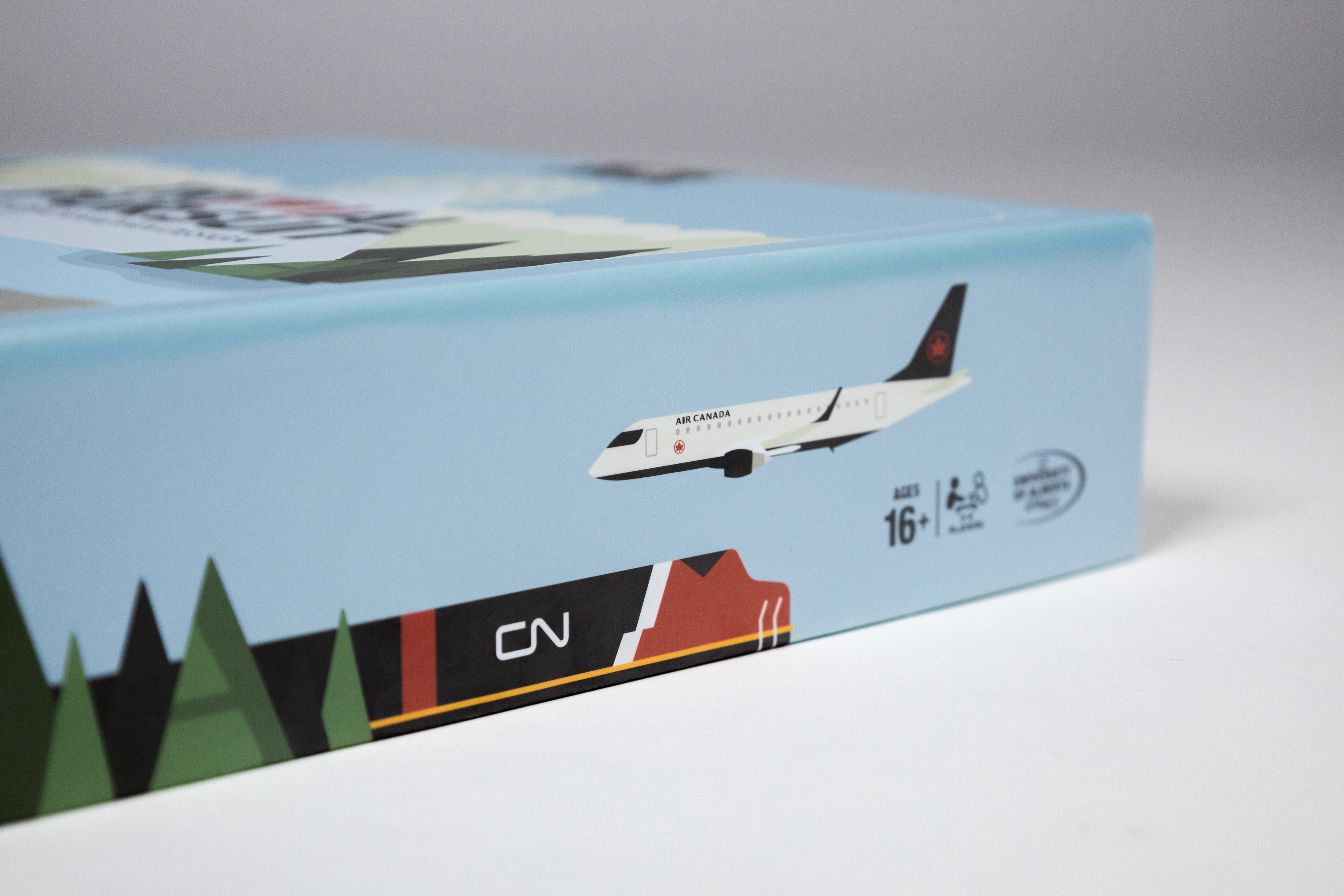
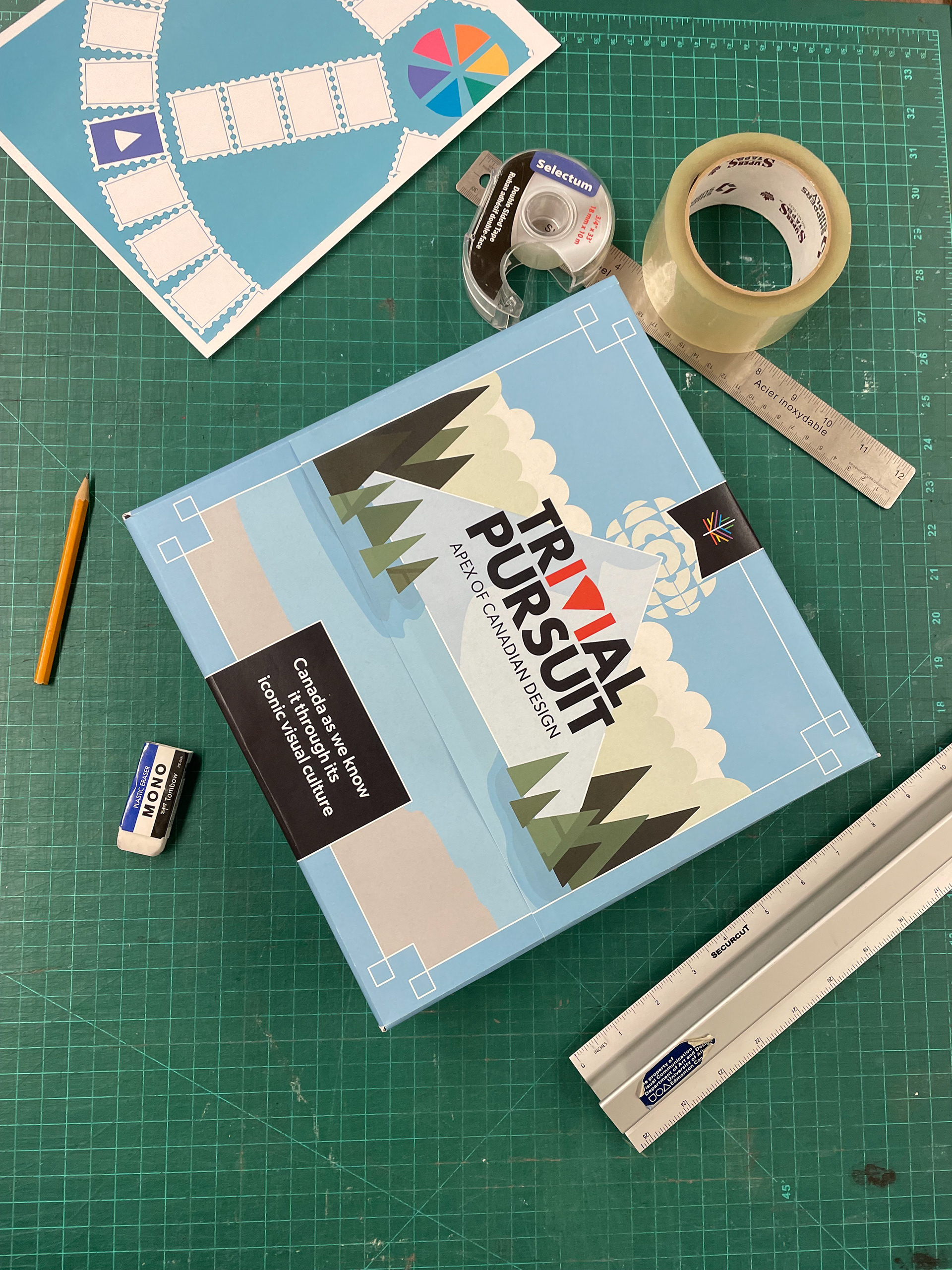
Box top - The idea of an apex reminded me of the mountain tops that I, as an Albertan, associate with the Canadian landscape. This made me think about ways to integrate Canadian design into the actual landscape and I came up with this idea of a scavenger hunt of Canadian design motifs.
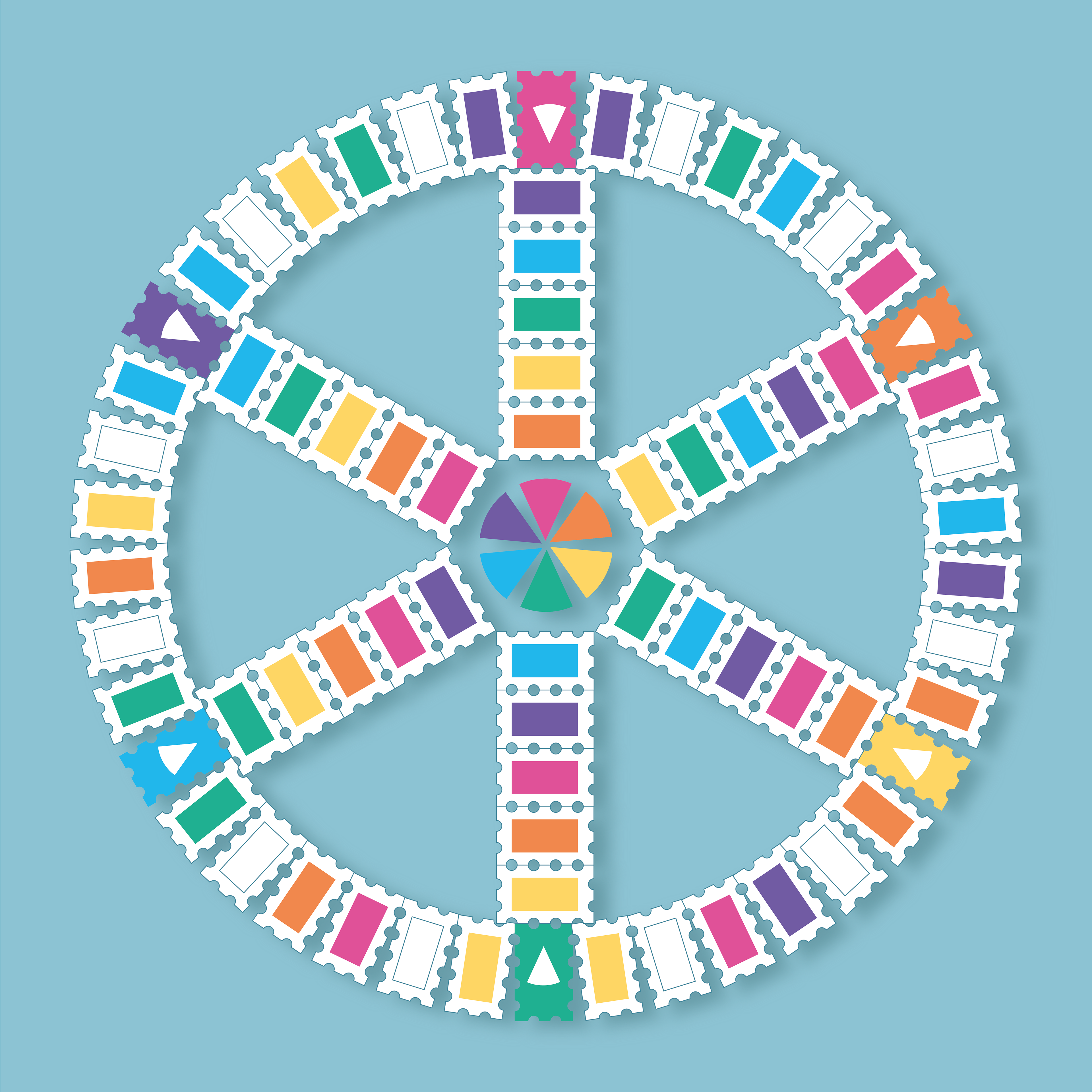
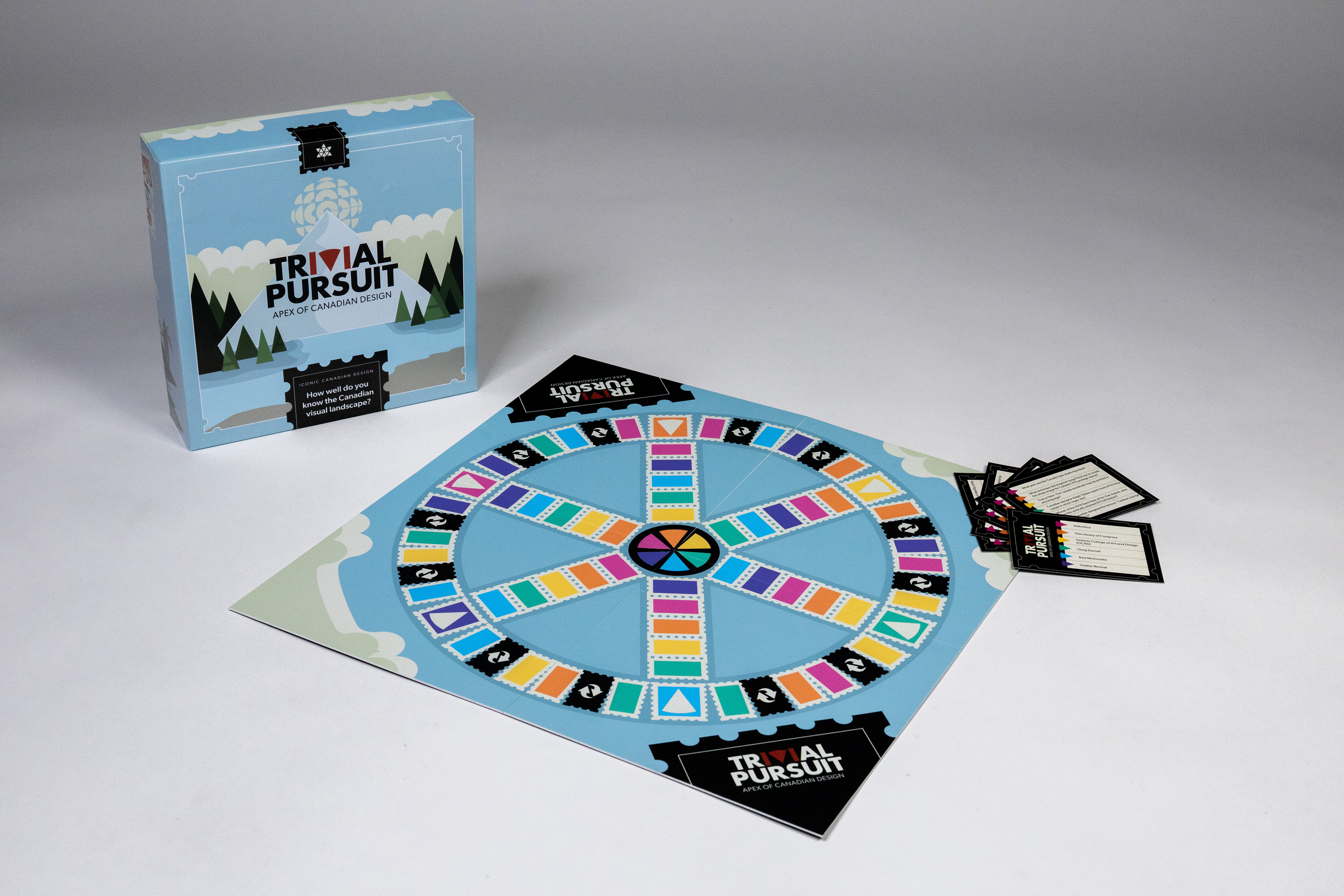
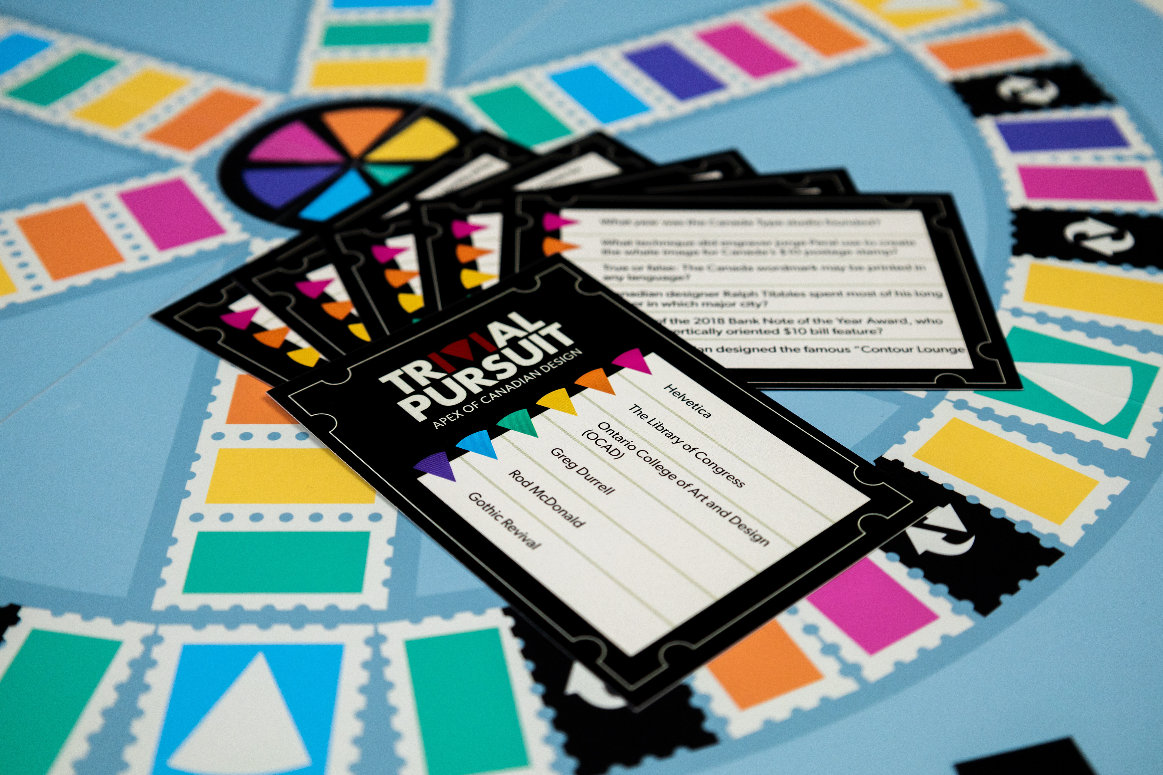
Game board - The ideation behind the gameboard comes from postage stamps. Me and my group mates were all assigned a Canadian designer to research before this redesign project, turns out many of our designers have designed postage stamps for Canada Post. Due to the fact we as a group strayed so far from the original Trivial Pursuit, I decided to keep the original colours associated with trivial pursuit, as a way to tie it back to the original game.
FINAL COMPONENTS
The final components, voted on and discussed with the group, and were designed by a final Individual.
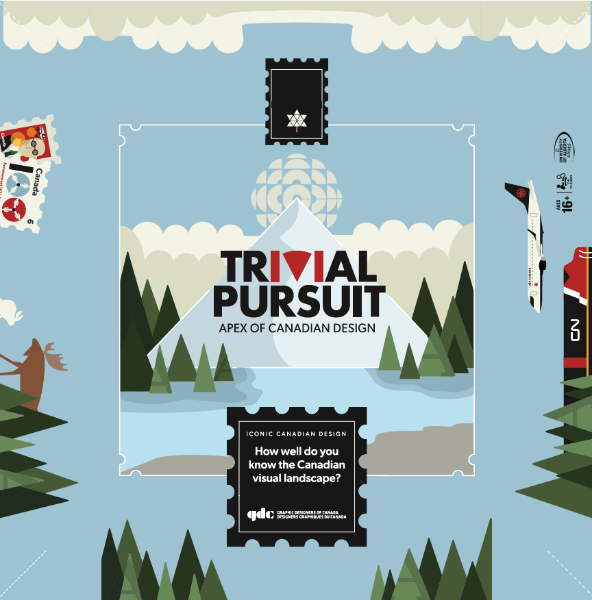
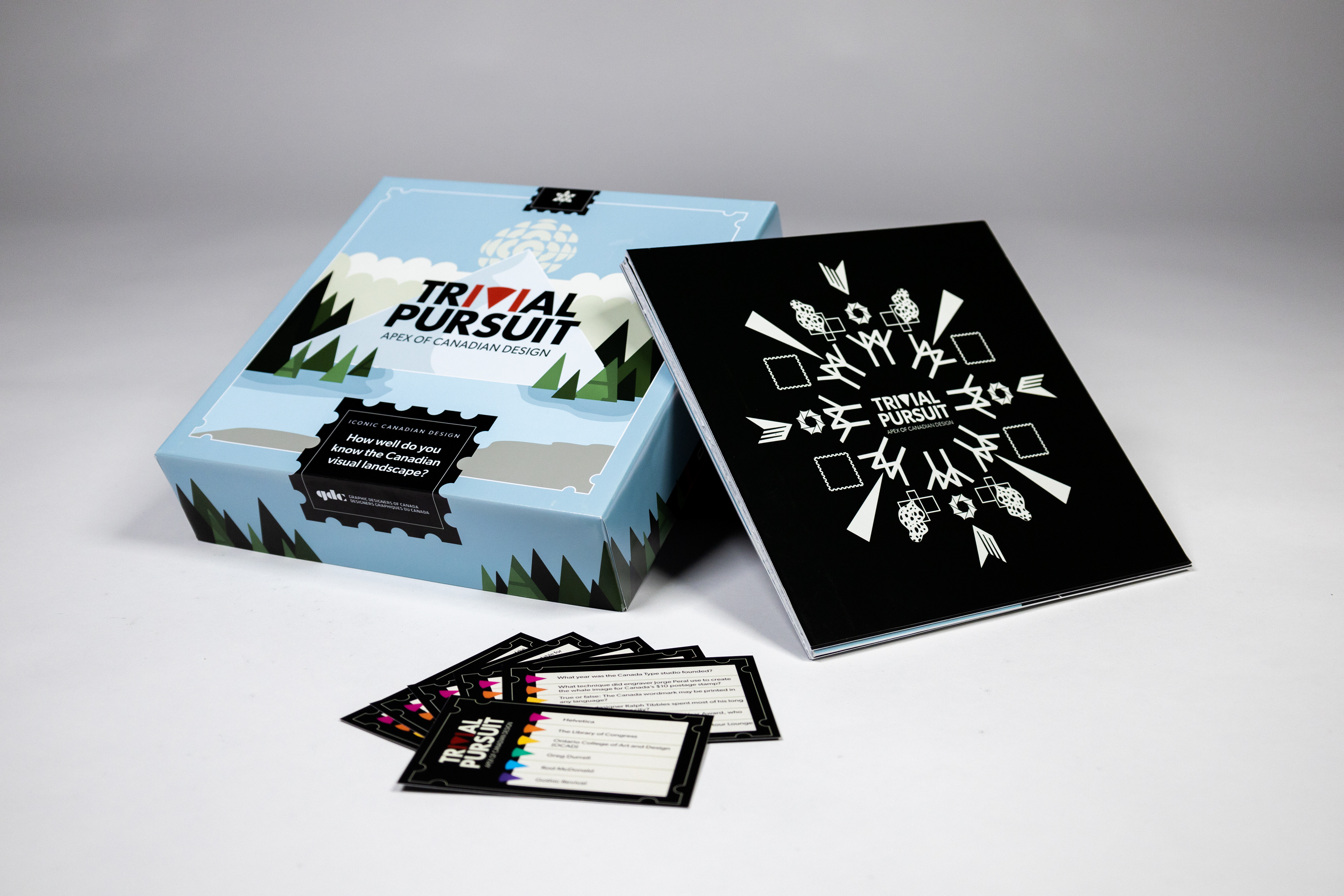
The final logotype utilizes the typeface Gibson, and the 'IVI" is coloured red to reference the Canadian flag. The "V" was also replaced by a pie shape to reference the original trivial pursuit game.
The box cover designed by myself was chosen as the most successful out of my peers' however, it did not work well with the chosen logotype. So, Rachel Schuck, redesigned the illustrative and organic drawings to be more geometric and rigid, while keeping the scavenger hunt idea. This made the whole look more cohesive and as the rest of the components came to be, components from them were added to the box top to again, make everything cohesive. For example, the stamp motif from the gameboard.
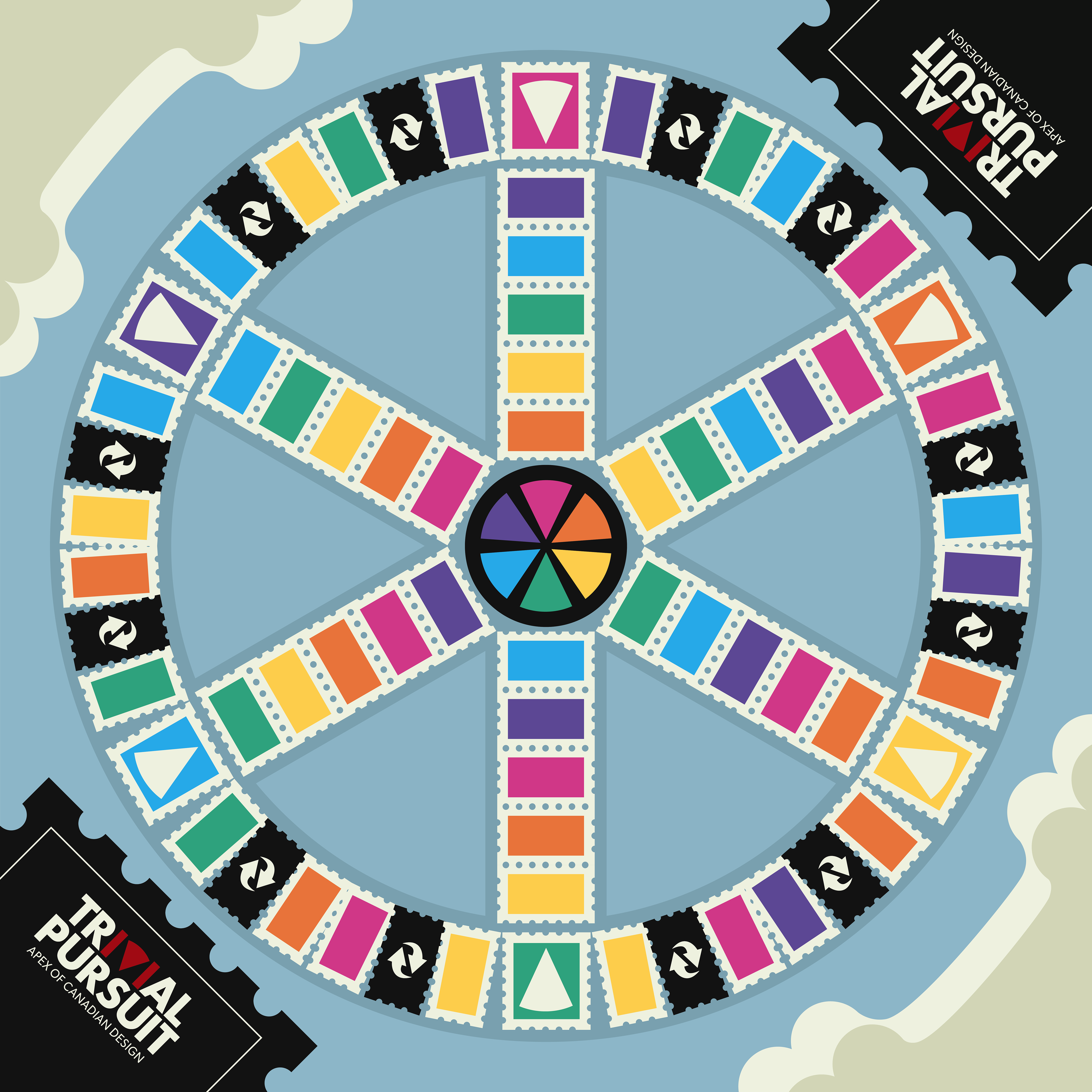
The final gameboard was designed by me. It is a polished version of the initial ideation, and utilizes aspects from Rachel's redesigned box top (colours, new geometric illustrations). The final design uses the original layout of a trivial pursuit board, but the landing spaces are defined by postage stamps.
ADDITIONAL COMPONENTS
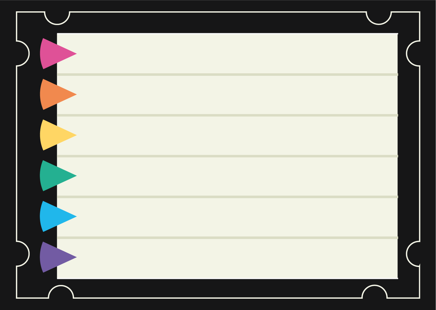
game card question side
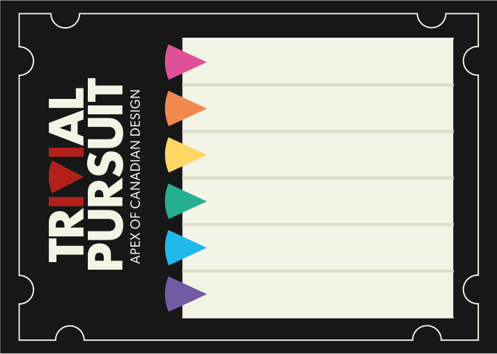
game card answer side
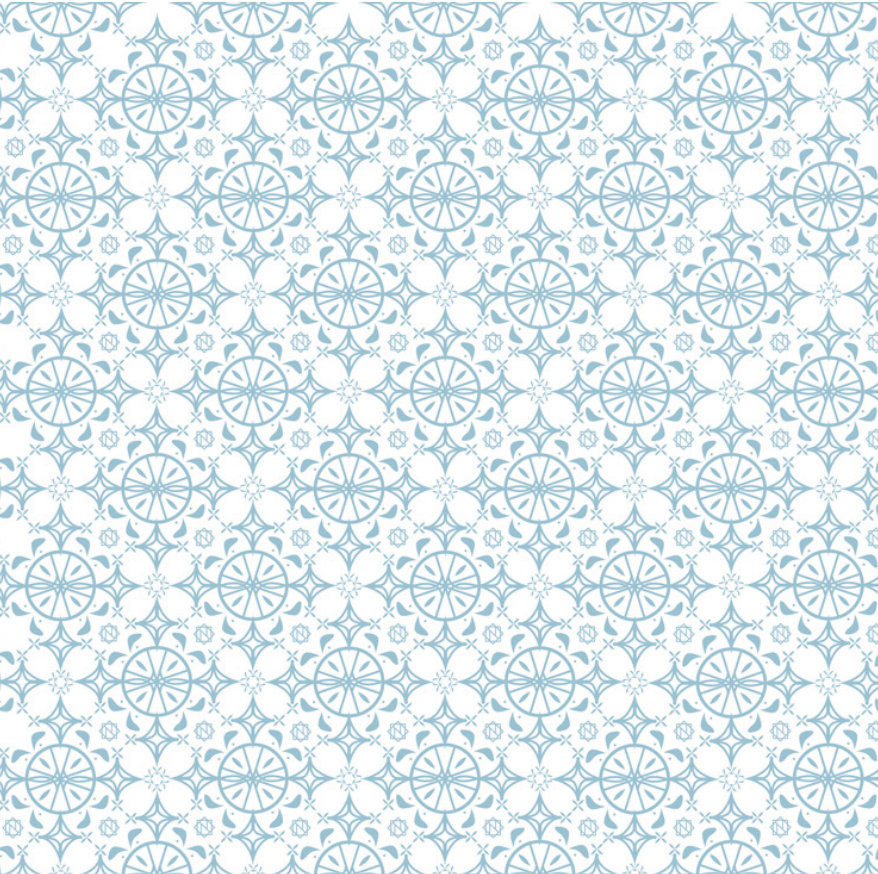
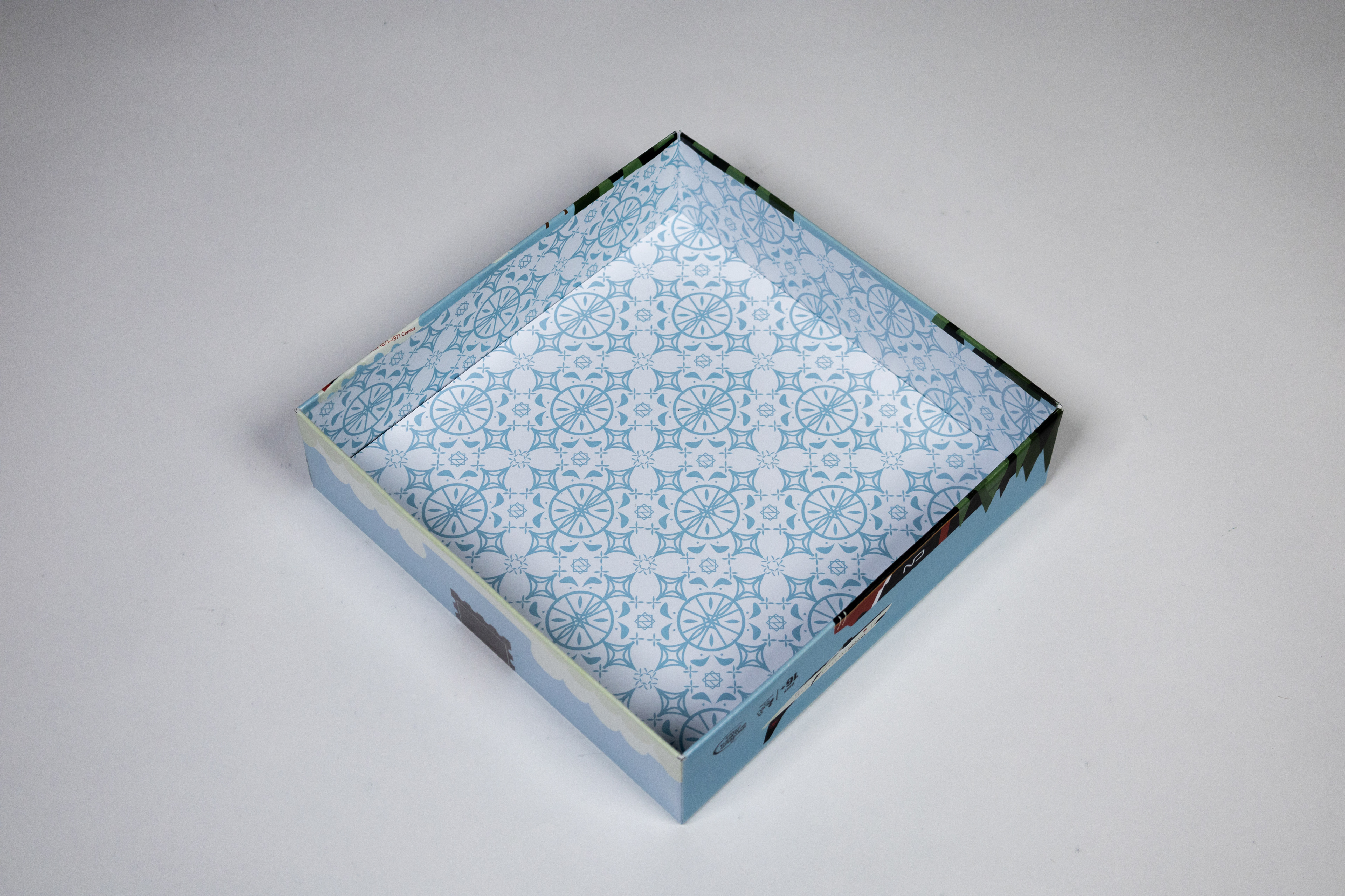
box lid, inside pattern - pattern designed by Katherine Shaw, inspired by Marian Banjes
game board, backside - pattern designed by Katherine Shaw, inspired by Marian Banjes
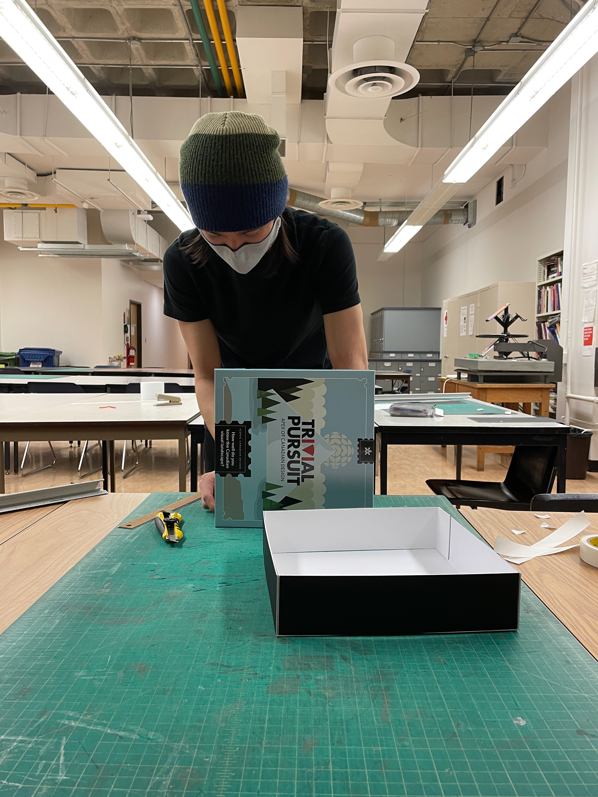
GAME CONSTRUCTED
Part of the assignment was to physically build and construct the board game as well, this was done by Jylee Halsted and Myself.
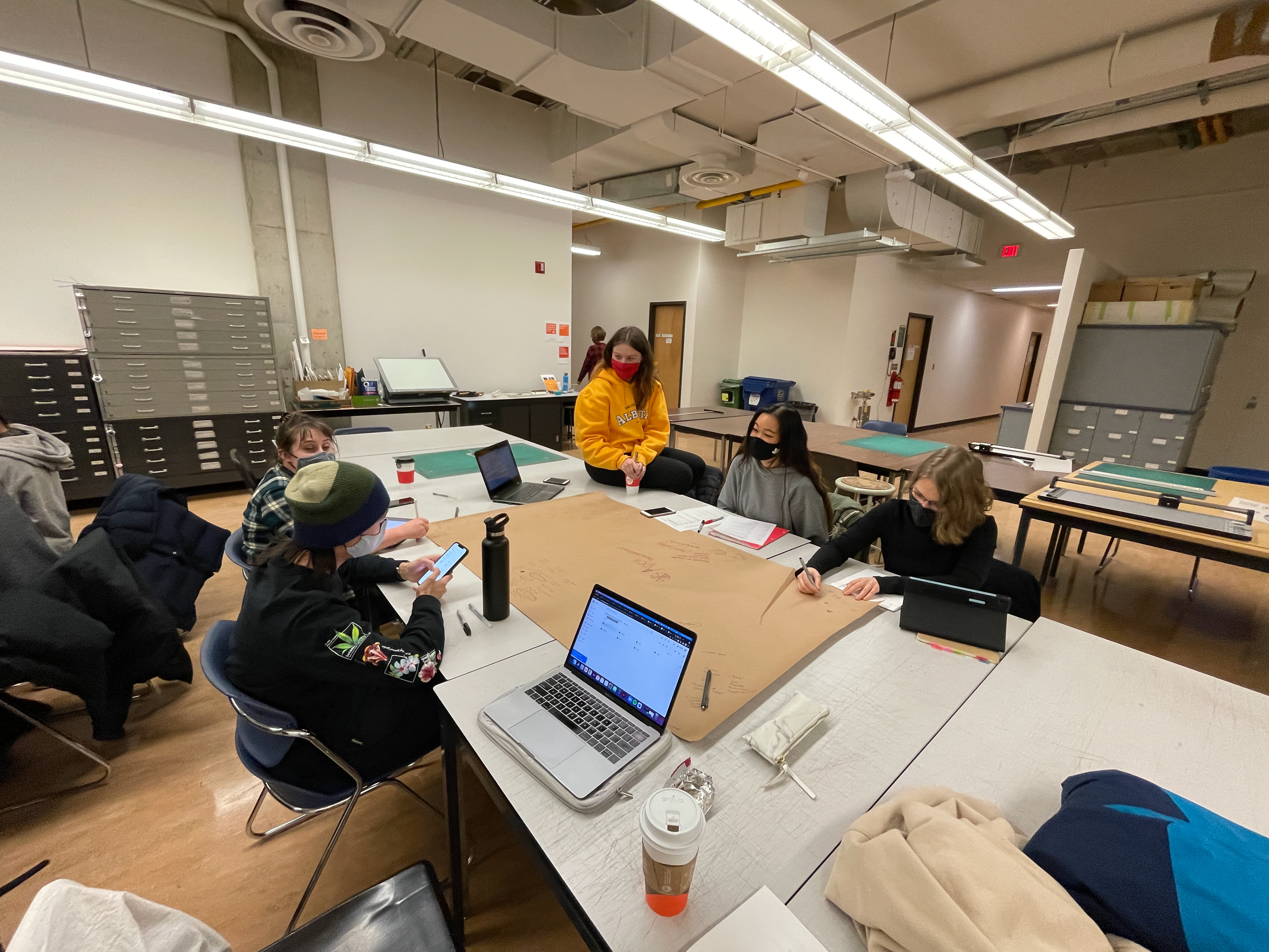
TEAM IMAGES

Procreate, Adobe Illustrator, Adobe Indesign